
Filament Progress Bar
#Filament Progress Bar



Reusable progress bar components for Filament 5 tables and infolists.
- Single shared API across
ProgressBarColumnandProgressBarEntry - Three-tier (success / warning / danger) coloring out of the box, with custom colors via CSS values
ascendinganddescendingthreshold directions for low-is-bad metrics (fuel, stock, battery)- Optional threshold map for any number of states with custom names
- Four sizes plus a custom bar height, two text positions, custom track color, and independent outer/inner border radii
- Self-contained stylesheet, dark-mode aware
- Proper
role="progressbar"semantics
#Requirements
- PHP
^8.2 - Filament
^5.0
#Installation
composer require devletes/filament-progress-bar
Then publish Filament assets so the package stylesheet is available to your panel:
php artisan filament:assets
The package ships its own stylesheet via Filament's asset manager — there is nothing to add to your custom Tailwind theme.
#Quick start
#Table column
use Devletes\FilamentProgressBar\Tables\Columns\ProgressBarColumn;

ProgressBarColumn::make('used')
    ->maxValue(fn ($record) => $record->quota)
    ->showProgressValue()
    ->showPercentage();
#Infolist entry
use Devletes\FilamentProgressBar\Infolists\Components\ProgressBarEntry;

ProgressBarEntry::make('leave_progress')
    ->label('Sick Leave')
    ->icon('heroicon-o-heart')
    ->iconColor('primary')
    ->getStateUsing(fn ($record) => [
        'progress' => $record->leave_used,
        'total' => $record->leave_total,
    ]);
#Providing data
The component accepts two styles of state:
1. A numeric value paired with maxValue(...):
ProgressBarColumn::make('used')
    ->maxValue(fn ($record) => $record->quota);
2. A structured array containing both the current value and the total:
ProgressBarColumn::make('leave_progress')
    ->state(fn ($record) => [
        'progress' => $record->used_days,
        'total' => $record->allocated_days,
    ]);
When the structured form is used, both keys are looked up flexibly. The first matching key wins:
| Role | Accepted keys |
|---|---|
| Current value | progress, current, value, used |
| Total | total, max, available, quota |
A missing or zero total resolves to 0% rather than throwing.
#Display
#Size
Methods: size('xs' | 'sm' | 'md' | 'lg') / height(string $value)
size(...) controls the bar height and inside-text size. Defaults to sm. Invalid values fall back to the default.
xsis a bar-only size. At1remthere is no room to stack text legibly on top of the fill, so anxsbar's text is hidden unless you move it below the bar withtextPosition('outside'). Either way the value still reaches screen readers througharia-valuetext.
To go outside the four presets, height(...) sets the bar height to any valid CSS length — pixels, rems, viewport units, custom properties, or clamp()/calc() expressions:
->height('0.5rem')
->height('48px')
->height('clamp(1rem, 4vw, 4rem)')
height(...) overrides only the bar height — size(...) still drives the text sizing, so pair a custom height with the preset whose text reads best at that height (sm for slim bars, lg for tall ones). Pass null (or omit the call) to keep the height that size(...) resolves to (1.5rem / 2rem / 2.5rem).
Values containing
;,<,>,{,}, or quotes are silently dropped to prevent inline-style injection. Stick to standard CSS length syntax.
#Text position
Method: textPosition('inside' | 'outside')
inside(default): the value/percentage is rendered on top of the fill, centered horizontally. Best for compact rows where you want the number visually anchored to the bar.outside: the value/percentage is rendered in a row beneath the bar, right-aligned. Best when you want a clean bar visual without text overlap, or when the value would be hard to read at low percentages.
#Show / hide value & percentage
Methods: showPercentage() / hidePercentage() / showProgressValue() / hideProgressValue()
Toggle each portion of the display text independently. When both are visible the text reads value / max (percentage). When only one is visible it appears alone. When both are hidden the bar renders without any text.
#Border radius
Methods: borderRadius(string $value) / innerBorderRadius(string $value)
Override the bar's corner radius with any valid CSS length — pixels, rems, percentages, custom properties, or calc() expressions:
->borderRadius('4px')
->borderRadius('0.5rem')
->borderRadius('calc(var(--radius) * 2)')
Pass null (or omit the call) to keep the default pill shape (9999px).
borderRadius(...) shapes the track and the fill together. innerBorderRadius(...) overrides the fill on its own, so the bar's outer silhouette and the shape of the progress edge can differ:
->innerBorderRadius('0')                      // flat progress edge inside a pill track
->borderRadius('4px')->innerBorderRadius('0')
The most common use is '0': the track keeps its rounded outline (the fill is still clipped by it on the leading side), while the trailing edge of the fill ends in a flat vertical line instead of a rounded cap. Pass null (or omit the call) and the fill inherits whatever borderRadius(...) resolves to — the existing behavior.
Values containing
;,<,>,{,}, or quotes are silently dropped to prevent inline-style injection. Stick to standard CSS length syntax.
#Thresholds and coloring
The bar resolves a status from the percentage and renders a color for that status. Two threshold APIs are available — start with the simple one and reach for the map only when three states aren't enough.
#Three-state mode (default)
Methods: warningThreshold(int|float $percentage) / dangerThreshold(int|float $percentage)
success → warning → danger, with thresholds you can tune individually:
ProgressBarColumn::make('cpu')
    ->warningThreshold(70)   // ≥ 70% → warning
    ->dangerThreshold(90);   // ≥ 90% → danger
Defaults: warning = 70, danger = 90.
#Threshold direction
Method: thresholdDirection('ascending' | 'descending')
By default higher percentages escalate toward danger (CPU, memory, used quota). For metrics where lower is worse (fuel, stock, battery), flip the direction:
ProgressBarColumn::make('battery_percent')
    ->thresholdDirection('descending')
    ->warningThreshold(30)   // ≤ 30% → warning
    ->dangerThreshold(10);   // ≤ 10% → danger
In descending mode the package uses sane defaults (warning = 30, danger = 10) and clamps danger ≤ warning.
#Threshold map (advanced)
Method: thresholds([$floor => $status])
For more than three states, or for non-monotonic mappings, pass a map of floor => status. The status name can be anything you want:
ProgressBarColumn::make('score')
    ->thresholds([
        80 => 'success',
        60 => 'warning',
        40 => 'info',
        0  => 'danger',
    ]);
Keys are interpreted as percentage floors — the highest matching floor wins. The example above maps ≥80 to success, 60–79 to warning, 40–59 to info, and <40 to danger.
If you omit a 0 floor, the lowest-defined status extends down to 0. For example, [80 => 'success', 10 => 'info'] resolves 0–79 to info (no implicit success fallback below the lowest floor).
The three legacy statuses — success, warning, danger — keep their package defaults (var(--success-500), var(--warning-500), var(--danger-500)). Any other status name (e.g. info, gray, secondary, or a custom one registered via your panel's ->colors([...])) auto-resolves to var(--{status}-500). No extra configuration needed.
For one-off colors that don't map to a Filament color (e.g. you want a specific 'excellent' status to be a particular shade of green), use statusColors([...]):
->statusColors([
    'excellent' => 'rgb(16 185 129)',
])
Likewise, custom labels for any status name go through statusLabels([...]):
->statusLabels([
    'info' => fn (int $percentage) => "Watch ({$percentage}%)",
])
#Colors
Methods: successColor(string $color) / warningColor(string $color) / dangerColor(string $color) / statusColors([$status => $color]) / trackColor(string $color)
Three named setters cover the default statuses. Each accepts any CSS color value or a closure:
->successColor('rgb(16 185 129)')
->warningColor(fn ($record) => $record->is_critical ? '#ff0000' : 'orange')
->dangerColor('var(--my-danger-color)')
Defaults reference Filament's semantic CSS variables (var(--success-500), var(--warning-500), var(--danger-500)), so the bar inherits your panel's theme automatically. To render a healthy bar in your brand color instead, pass ->successColor('var(--primary-500)').
For custom statuses (map mode), use statusColors([...]). When both statusColors and the named setters define the same status, the map wins — named setters fill in any keys the map omits.
Those setters all color the fill. trackColor(...) colors the track behind it, replacing the neutral gray with any valid CSS color value — including a custom property, so the track can follow your theme:
->trackColor('rgb(229 231 235)')
->trackColor('var(--primary-100)')
->trackColor('color-mix(in oklab, var(--primary-500) 15%, transparent)')
A custom track color wins in both light and dark mode, replacing the package defaults (rgb(229 231 235) and rgb(255 255 255 / 0.1)). To keep the track theme-aware, pass a CSS variable your panel theme redefines per mode rather than a fixed color:
:root { --my-track: rgb(229 231 235); }
html.dark { --my-track: rgb(255 255 255 / 0.1); }
->trackColor('var(--my-track)')
Pass null (or omit the call) to keep the dark-mode-aware default.
Values containing
;,<,>,{,}, or quotes are silently dropped to prevent inline-style injection. Stick to standard CSS color syntax.
#Labels
Methods: successLabel(string $label) / warningLabel(string $label) / dangerLabel(string $label) / statusLabels([$status => $label])
Per-status labels are shown above the bar in infolist entries only (table columns intentionally skip them for compact rows). They accept a string or a closure receiving useful context:
->successLabel('On track')
->warningLabel(fn (int $percentage) => "Watch ({$percentage}%)")
->dangerLabel(fn (float $current, ?float $total) => "{$current} / {$total} used")
For custom statuses (map mode), use statusLabels([...]).
#Closure parameters
Most setters accept a closure. The following parameters are injected when present:
$state— the raw column/entry state$record— the Eloquent model$current— the resolved current value (float)$total— the resolved total (float|null)$percentage— the integer percentage (0–100)$status— the resolved status name
The percentage- and status-aware parameters are populated after the bar's value has been resolved, so closures used for colors and labels can branch on the final percentage.
#Recipes
Battery / fuel (low is bad):
ProgressBarColumn::make('battery_percent')
    ->thresholdDirection('descending')
    ->warningThreshold(30)
    ->dangerThreshold(10);
Multi-state quality score (using Filament's built-in colors):
ProgressBarColumn::make('quality')
    ->thresholds([
        90 => 'success',
        70 => 'info',
        40 => 'warning',
        0  => 'danger',
    ]);
Squared bars matching a card design system:
ProgressBarColumn::make('used')
    ->maxValue(fn ($record) => $record->quota)
    ->borderRadius('4px')
    ->size('md');
Compact column without any text overlay:
ProgressBarColumn::make('leave_progress')
    ->state(fn ($record) => [
        'progress' => $record->leave_used,
        'total' => $record->leave_total,
    ])
    ->hideProgressValue()
    ->hidePercentage();
Dynamic per-record color:
ProgressBarColumn::make('progress')
    ->successColor(fn ($record) => $record->is_priority ? '#7c3aed' : null);
Infolist entry with icon, inline label, and rich danger text:
ProgressBarEntry::make('inventory')
    ->label('Stock remaining')
    ->icon('heroicon-o-cube')
    ->iconColor('primary')
    ->inlineLabel()
    ->getStateUsing(fn ($record) => [
        'progress' => $record->stock,
        'total' => $record->capacity,
    ])
    ->thresholdDirection('descending')
    ->warningThreshold(40)
    ->dangerThreshold(15)
    ->dangerLabel(fn (float $current, ?float $total) => "Only {$current} left of {$total}");
#API reference
#Value
| Method | Notes |
|---|---|
maxValue(int|float|Closure|null) |
Used with a numeric state value |
state(...) / getStateUsing(...) |
Filament native; pass a structured array for current+total |
#Display
| Method | Notes |
|---|---|
size('xs'|'sm'|'md'|'lg') |
Default sm; xs hides its text unless textPosition('outside') |
height(string|Closure|null) |
Any CSS length; overrides the height from size(...) |
textPosition('inside'|'outside') |
Default inside |
showPercentage(bool|Closure) / hidePercentage(bool|Closure) |
Default shown |
showProgressValue(bool|Closure) / hideProgressValue(bool|Closure) |
Default shown |
borderRadius(string|Closure|null) |
Any CSS length; default pill |
innerBorderRadius(string|Closure|null) |
Any CSS length; shapes the fill only, defaults to borderRadius(...) |
#Thresholds
| Method | Notes |
|---|---|
warningThreshold(int|float|Closure) |
Default 70 (or 30 in descending) |
dangerThreshold(int|float|Closure) |
Default 90 (or 10 in descending) |
thresholdDirection('ascending'|'descending'|Closure) |
Default ascending |
thresholds(array|Closure) |
Tier overrides OR a [floor => status] map |
#Colors
| Method | Notes |
|---|---|
successColor(string|Closure|null) |
Default var(--success-500) |
warningColor(string|Closure|null) |
Default var(--warning-500) |
dangerColor(string|Closure|null) |
Default var(--danger-500) |
statusColors(array|Closure|null) |
Map of status => color for custom statuses |
trackColor(string|Closure|null) |
Any CSS color; default neutral gray, dark-mode aware |
#Labels (infolist entries only)
| Method | Notes |
|---|---|
successLabel(string|Closure|null) |
Hidden by default |
warningLabel(string|Closure|null) |
Hidden by default |
dangerLabel(string|Closure|null) |
Hidden by default |
statusLabels(array|Closure|null) |
Map of status => label for custom statuses |
#Infolist-only
The ProgressBarEntry extends Filament's Entry and supports the standard label(...), inlineLabel(), hiddenLabel(), icon(...), and iconColor(...) methods.
#Integration examples
A ProgressBarColumn rendered inside a Filament resource table, one row per option — sizes, text position, thresholds, border radius, custom height, a flat inner radius, and a tinted track:
A ProgressBarEntry inside an infolist with icons, custom labels, a tall height(...) bar whose fill ends flat via innerBorderRadius('0'), a trackColor(...) tinted track, and a descending-threshold "Stock remaining" bar:
#Need something custom?
We build production Filament panels and plugins for teams that want to ship fast without compromising on polish. If you need a custom feature, an extended variant of this package, or a fully bespoke component built for your stack, we can help.
- Browse the rest of our Filament work: filament.devletes.com
- Get in touch: salman@devletes.com
Typical engagements: new Filament plugins, custom resources/widgets/actions, theme + UX work, integrations with your existing services, and one-off tailored forks of our open-source packages.
#Have you seen our Orbit theme?
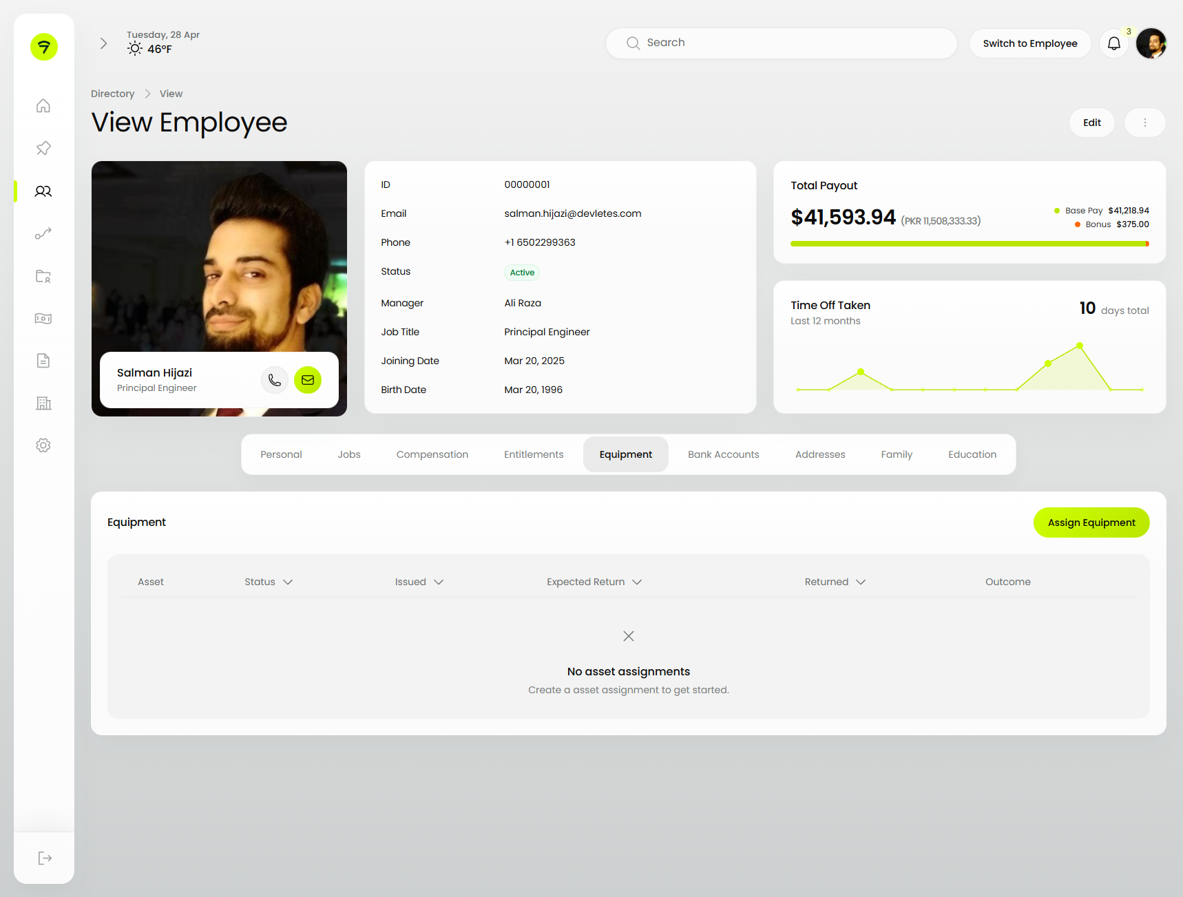
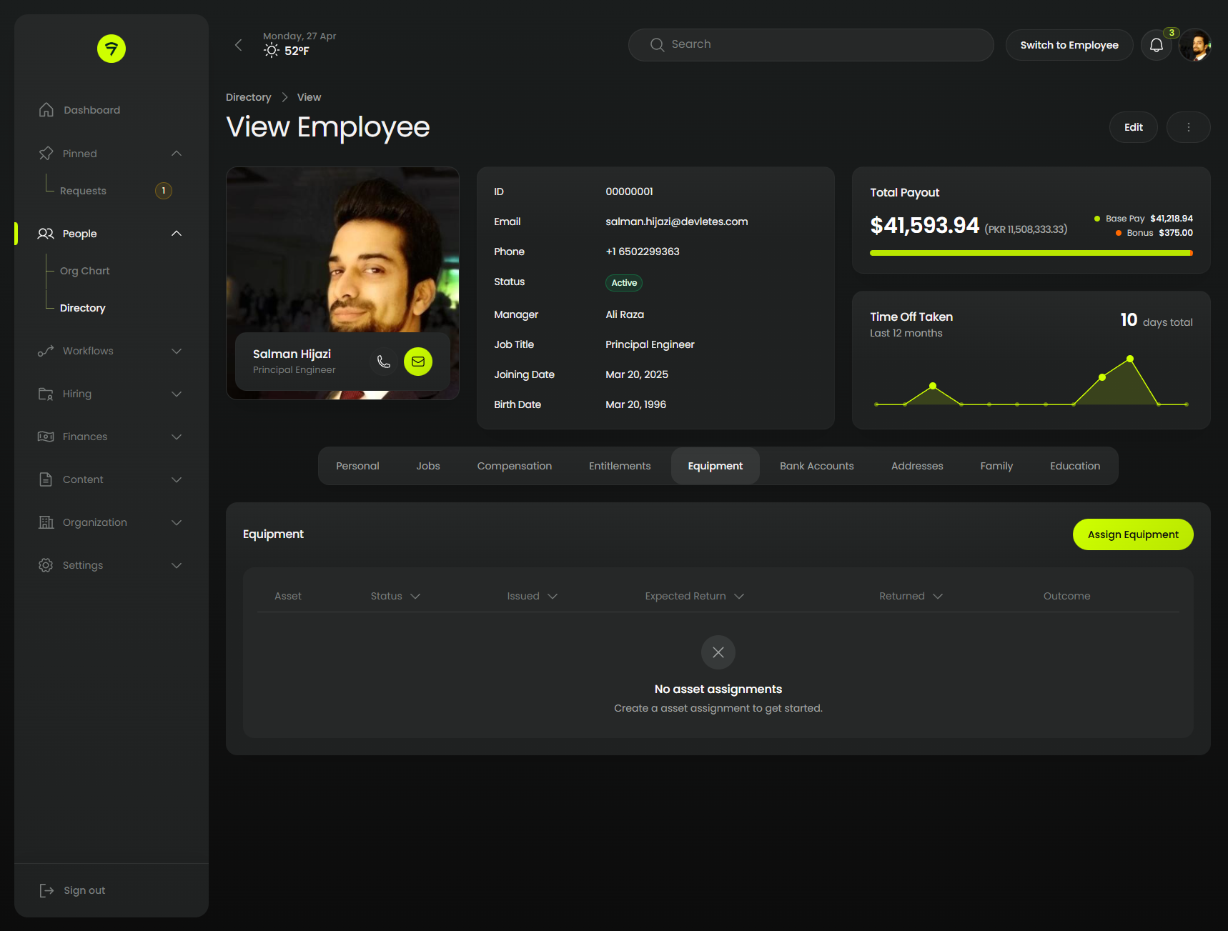
Orbit is our dark-first theme for Filament 5. Every panel surface is restyled — sidebar, topbar, forms, tables, modals, notifications.
 |
 |
#Credits
#License
MIT. See LICENSE.md.